Time Series Visualization with Microsoft Fabric
Last updated: January 2026
Overview
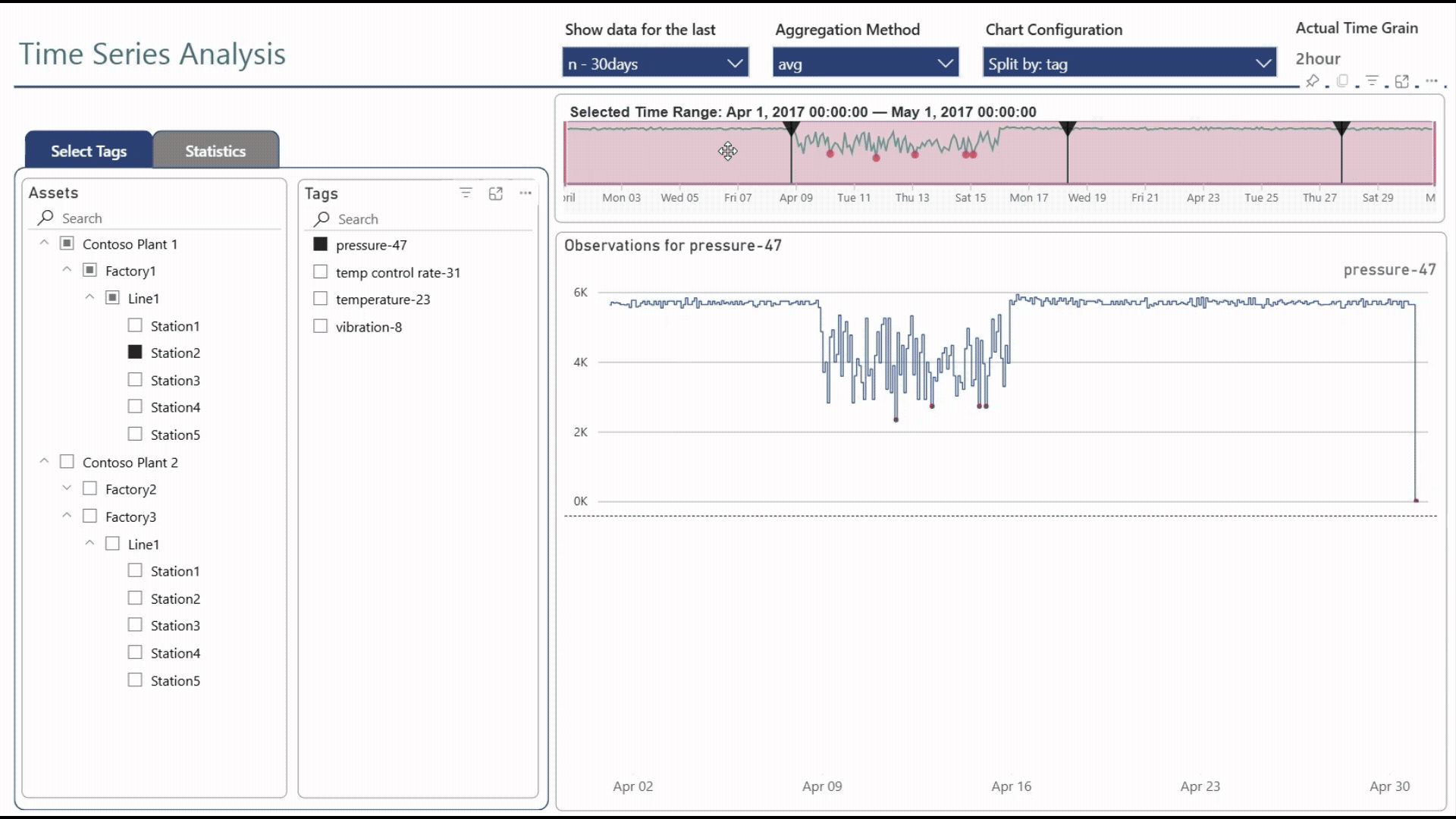
This solution accelerator helps you analyze time series data in Power BI using an interactive brush-based selection experience combined with a KQL Database in Microsoft Fabric (or Azure Data Explorer). Simply select what metrics to analyze, select an initial time period, and choose how to lay out your charts. Then, drag the time-brushing controls to select any portion of the time range with your visuals updating instantly, even when working with billions of rows.
This solution accelerator uses tag-based data, which is common in operational and industrial control scenarios (a tag is just an identifier for an instrument or device). Yet, this solution can be adapted to numerous other time-series analytics scenarios.
Disclaimer
This solution accelerator is a community project and is not developed, maintained, or supported by Microsoft. It is provided "as-is" without warranty of any kind. Use at your own discretion.
Key Capabilities
Interactive Time Selection
- Start by choosing a time period using relative time period filters or custom date ranges
- Zoom into any time range on the timeline chart
- See the full context including anomalies and timeline markers for important events
- All visuals update automatically when you change the time range
Rich Time Series Visualization
- Intelligent binning of high-density time series into adaptive time spans allows working with billions of data points
- Compare multiple metrics for multiple assets, metrics and tags side by side
- Choose aggregation (average, sum, min, max) and time granularity
- Detect anomalies and highlight them on your charts
- View descriptive statistics and correlations between different time series
- Contextualize time series data with details about asset hierarchies and tag metadata
- Intuitive chart layouts help you identify trends, patterns and relationships in your data
Solution Components
| Component | Purpose |
|---|---|
| KQL Database | Highly scalable time series storage, processing and query capabilities |
| Power BI Semantic Model | DirectQuery mode delegates query execution to KQL Database |
| Dynamic M Query Parameters | Pass user inputs to construct custom queries |
| Power Query Functions | Parse parameters and implement advanced logic |
| Field Parameters | Enable end users to customize chart layouts |
| Time Series Brush Slicer | Custom visual for intuitive time navigation |
| Power BI Report | Rich and highly-interactive data visualization |
Solution Variants
This solution accelerator includes two Power BI projects:
-
Basic Solution
Demonstrates the core time series visualization concepts and can be easily customized to work with your data with minimal skill and effort.
-
Advanced Solution
Demonstrates a broader range of capabilities and offers more flexibility with customization. Requires more effort and higher technical proficiency.
Prerequisites
- Power BI Desktop (latest version recommended)
- Microsoft Account with access to:
- A KQL Database (Microsoft Fabric or Azure Data Explorer)
- A Fabric Workspace (to publish and share your report)
Sample Data Available
Both solutions come pre-configured to use a publicly-accessible KQL database with sample data, so you can try them out immediately without setting up your own data source.
Explore the Documentation
-
Getting Started
- Basic Solution — Quick setup with core concepts
- Advanced Solution — Full-featured implementation
-
Solution Design
- Architecture — Components and interaction flow
- Configuration Options — Customization reference
- Brush Slicer — Custom visual details
-
Resources
- External Links — Related resources
- Contributing — How to contribute to this project